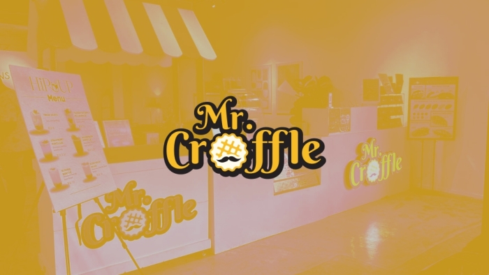
The Mr. Croffle branding is warm, inviting, and deliciously playful—perfectly capturing the charm of a modern dessert brand. The identity centers around a friendly, handcrafted logo that combines bold typography with a fun croffle icon, instantly communicating the product’s personality and flavor.
The main logotype features rounded, bubbly lettering with a rich dark outline, giving the brand a comforting yet trendy look. The highlight is the croffle icon embedded within the word “Croffle,” illustrated with a golden crisp texture and a waffle grid pattern that visually reinforces the product’s identity.
The brand is also shown across different background variations—white, yellow, and black—demonstrating strong flexibility while maintaining visual consistency and clarity.
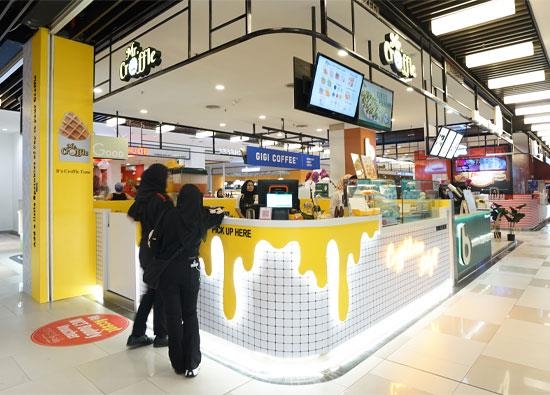
Mr. Croffle’s visual identity is crafted to stand out in food & beverage spaces, offering a memorable and appetizing look that invites customers to indulge.