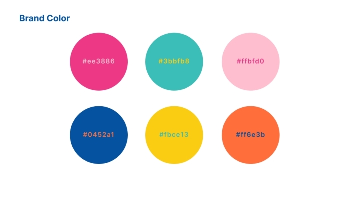
Kechil is a vibrant, expressive, and youthful brand identity built around playful energy and bold self-expression. The branding combines colourful handwritten typography, pop-art–inspired illustrations, and dynamic graphic elements to create a fun, modern, and unmistakably lively visual universe.
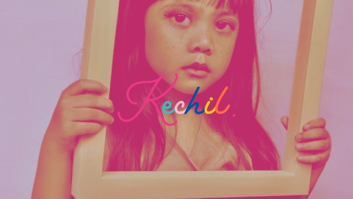
At the heart of the brand is the main Kechil logo, featuring a fluid, handwritten script in a rainbow gradient—symbolising creativity, diversity, and joy. The secondary logo, a simple elegant “K,” offers a minimal yet stylish alternative for compact use.
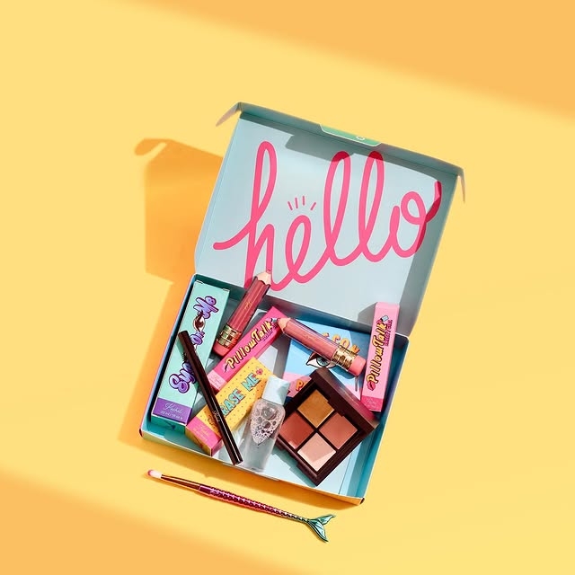
The graphic elements—featuring bold lips, expressive eyes, lightning bolts, playful icons, and retro-inspired shapes—bring a quirky pop-culture edge. These illustrations give the brand a loud, confident, and youthful attitude that stands out instantly.
The overall brand direction communicates creativity, positivity, and expressive individuality, suitable for a fun lifestyle brand, youth-focused products, or a modern creative platform. Kechil’s visual identity is designed to radiate joy, confidence, and colourful personality in every application.